Before they became memorable, they became recognizable.
Some typefaces draw a word.
Others end up defining an entire era.
Created in 1957 by Max Miedinger, Helvetica was born with a rare ambition: to be neutral. No excess, no noise, no ego. Perhaps that is precisely why it became one of the most recognizable visual languages on the planet.
While many brands searched for distinction through ornament, these understood something else: recognition often begins with clarity.
Because iconic rarely needs to shout.
7. Fendi
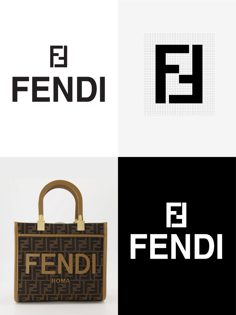
Before monograms dominated luxury, Fendi already understood the weight of a well-drawn word.
The Helvetica-based logo works because it never tries to compete with the extravagance of the brand’s own universe. Its elegance lies precisely in restraint. Solid letterforms, rigorous spacing and silent confidence.
Associated with the vision of Karl Lagerfeld, who created the iconic double F in 1966, Fendi’s visual system became a cultural signature.
Luxury without ornament is still luxury.
6. Knoll
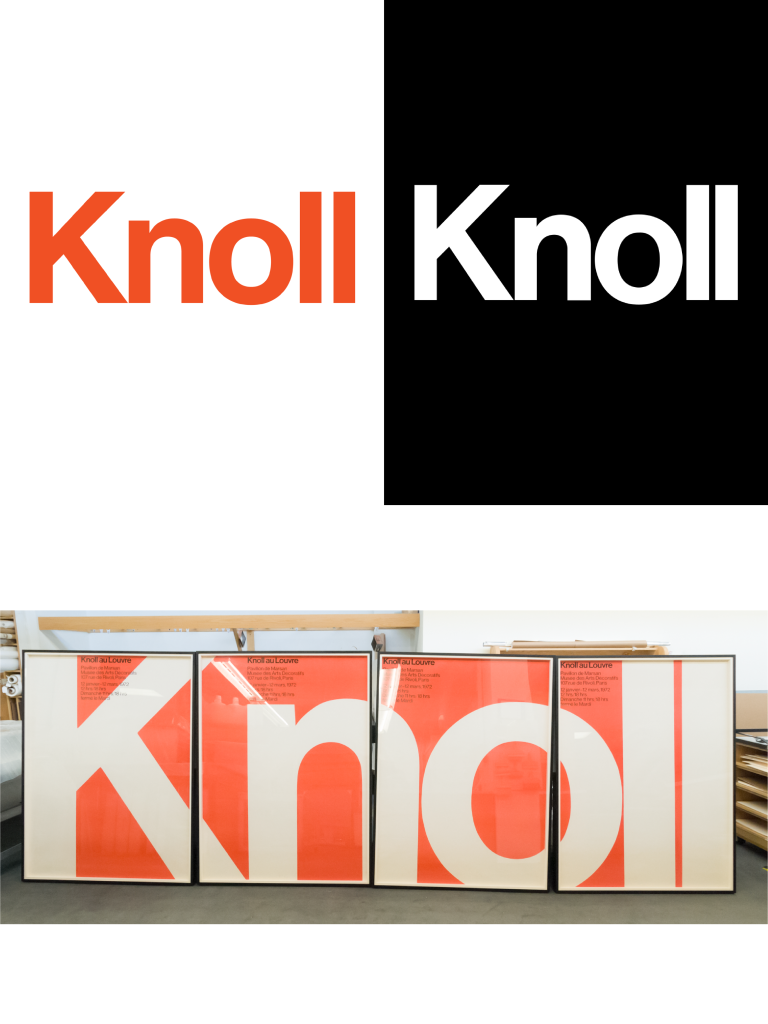
Knoll is perhaps one of the most honest examples of the connection between modernism and Helvetica.
It makes sense. A brand connected to modern furniture, architecture and rationalism could hardly
communicate through any other visual language. The logo feels designed with the same discipline as the
objects it produces.
The identity was developed by Herbert Matter and later refined by Massimo Vignelli, two unavoidable
names in international modernist language.
Everything about it conveys structure, proportion and permanence.
5. Jeep
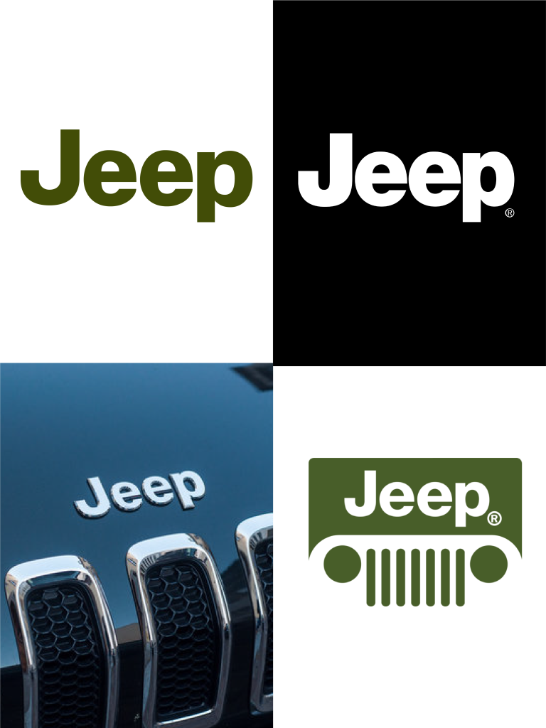
Few automotive brands manage to feel this robust using only a word.
Jeep proves that Helvetica can also feel mechanical, physical and almost military. There is no artificial
speed, aggressive italics or futuristic tricks. Only visual weight and clarity.
It is a logo that feels capable of crossing mud without losing legibility.
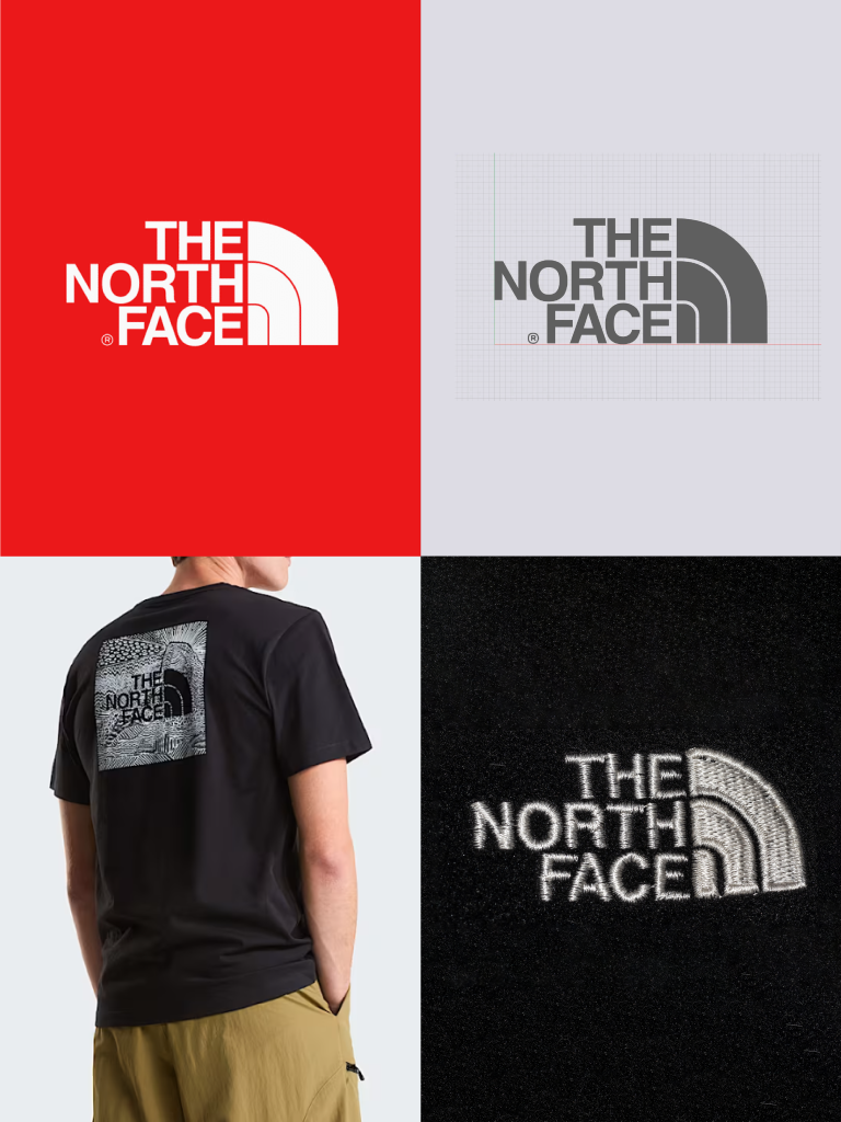
4. The North Face
Helvetica was born in Swiss neutrality. Curiously, it ended up climbing mountains.
In the case of The North Face, the typography works as the perfect counterbalance to the symbol. While the icon suggests exploration and movement, Helvetica keeps everything grounded, technical and functional.
Designed by David Alcorn and inspired by Half Dome in Yosemite National Park, the symbol became one of
the icons of contemporary outdoor culture.
Less graphic adventure. More trust.
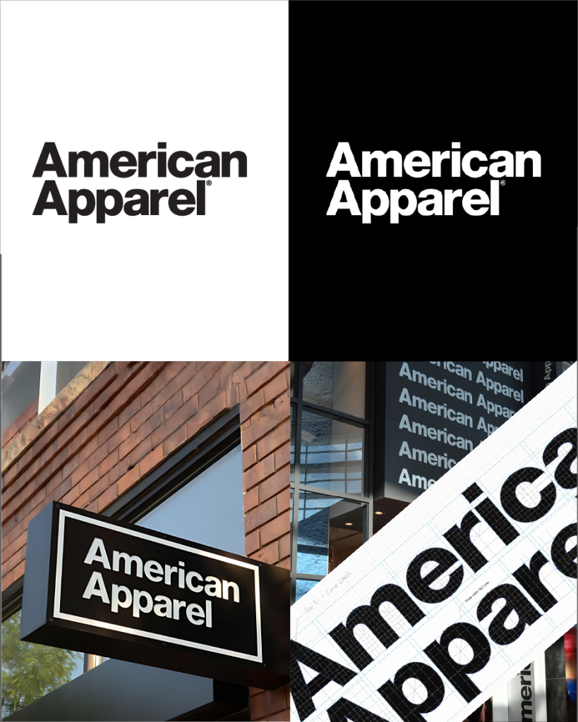
3. American Apparel
The logo was not just identity. It was attitude. Raw, direct, urban, almost editorial. The brand understood
something important: when typography is strong enough, the rest of communication can breathe.
O logotipo não era apenas identidade. Era atitude. Cru, direto, urbano, quase editorial. A marca percebeu algo importante: quando a tipografia é suficientemente forte, o resto da comunicação pode respirar.
Few logos managed to make neutrality feel this provocative.
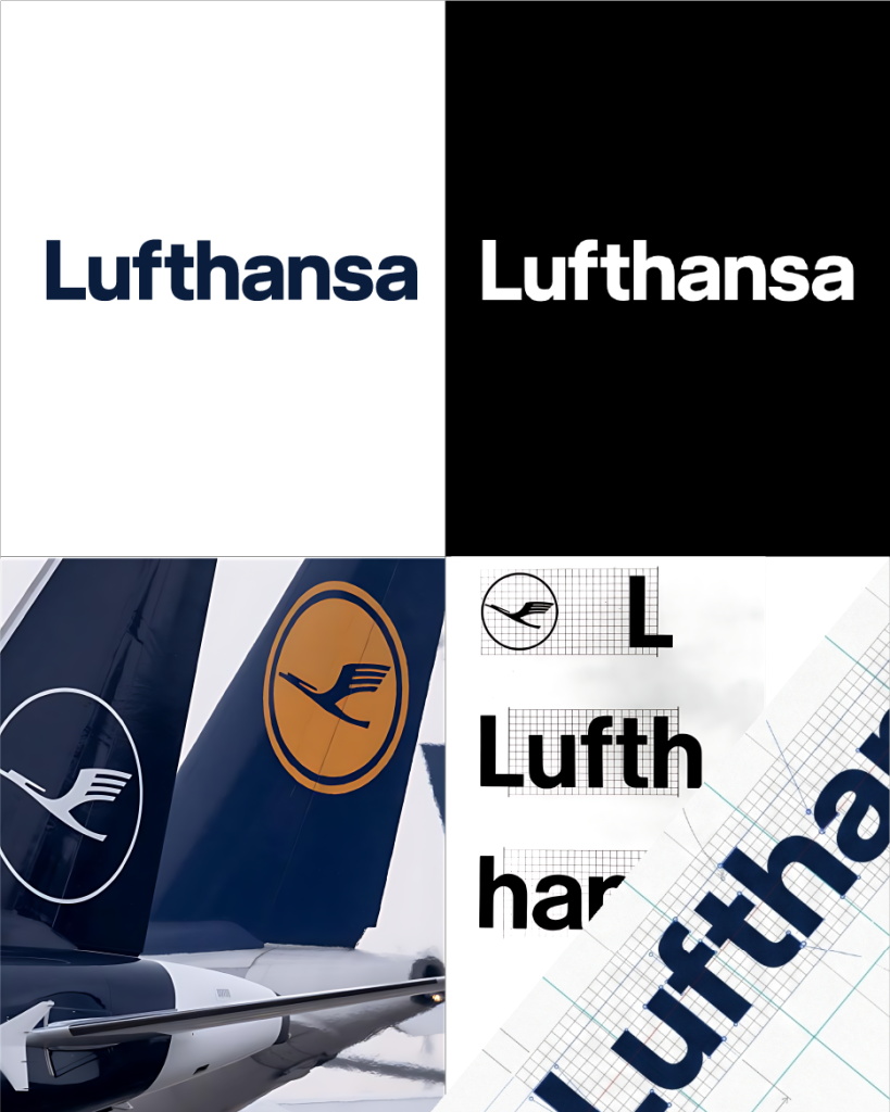
2. Lufthansa
Some brands use Helvetica Others practically institutionalized it.
Lufthansa helped show the world that clarity can also be premium. The airline’s visual system became a
global reference for graphic rigor, especially in the way Helvetica coexisted with the iconic crane symbol.
Much of that visual discipline comes from the work of Otl Aicher, responsible for one of the most influential corporate identity systems of the twentieth century.
Aviation, precision and modernity within the same visual sentence.
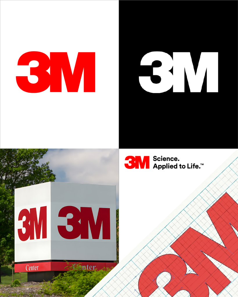
1. 3M
The greatest Helvetica logo may also be one of the most inevitable.
3M reduces everything to the essential: two characters, typographic weight and absolute presence. There is no excessive visual narrative, nor any attempt to appear contemporary. And perhaps that is exactly why it has remained contemporary for decades.
The modern version of the identity was developed by Siegel+Gale and designed by Stephen Dunne,
consolidating one of the purest exercises in corporate typographic rationalism.
Conclusion
In the end, perhaps that’s what makes Helvetica so difficult to judge. It is impossible to separate it from the very history of modern design.
Throughout this Top 7, we realized that the best Helvetica logos rarely rely solely on the typeface itself, but on the intelligence of the person using it. Because Helvetica never does the work alone.
That was also what made this ranking difficult. There are dozens of iconic brands built around it. But in the end, what prevailed was what Helvetica itself has always done best: the recognizable, the timeless, and the inevitably iconic.
At the studio, there is an openly emotional relationship with this typeface. Among books, posters, and modernist references, it continues to hold a special place in our library.
‘It's the typeface Ricardo would take to a desert island.’
Perhaps because few typefaces are capable of surviving trends, excess, and time all at once.
For anyone who wants to dive deeper into this universe:
— Helvetica Forever — Lars Müller — Helvetica and the New York City Subway System — Paul Shaw — Grid Systems in Graphic Design — Josef Müller-Brockmann — The Elements of Typographic Style — Robert Bringhurst — Helvetica — Gary Hustwit
More than a typeface, Helvetica became an entire visual language. And few have aged with such authority.