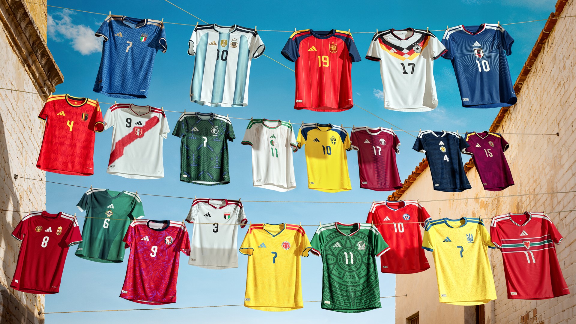
Some shirts dress players. Others dress symbols, countries, memories, and entire sticker albums.
In this TOP 7, we look at the 2026 World Cup kits for what they also are: graphic objects.
From patterns, crests, and national colors to nostalgia and a touch of boldness, we’ve selected seven designs that are visually compelling, culturally recognizable, and, above all, well designed.
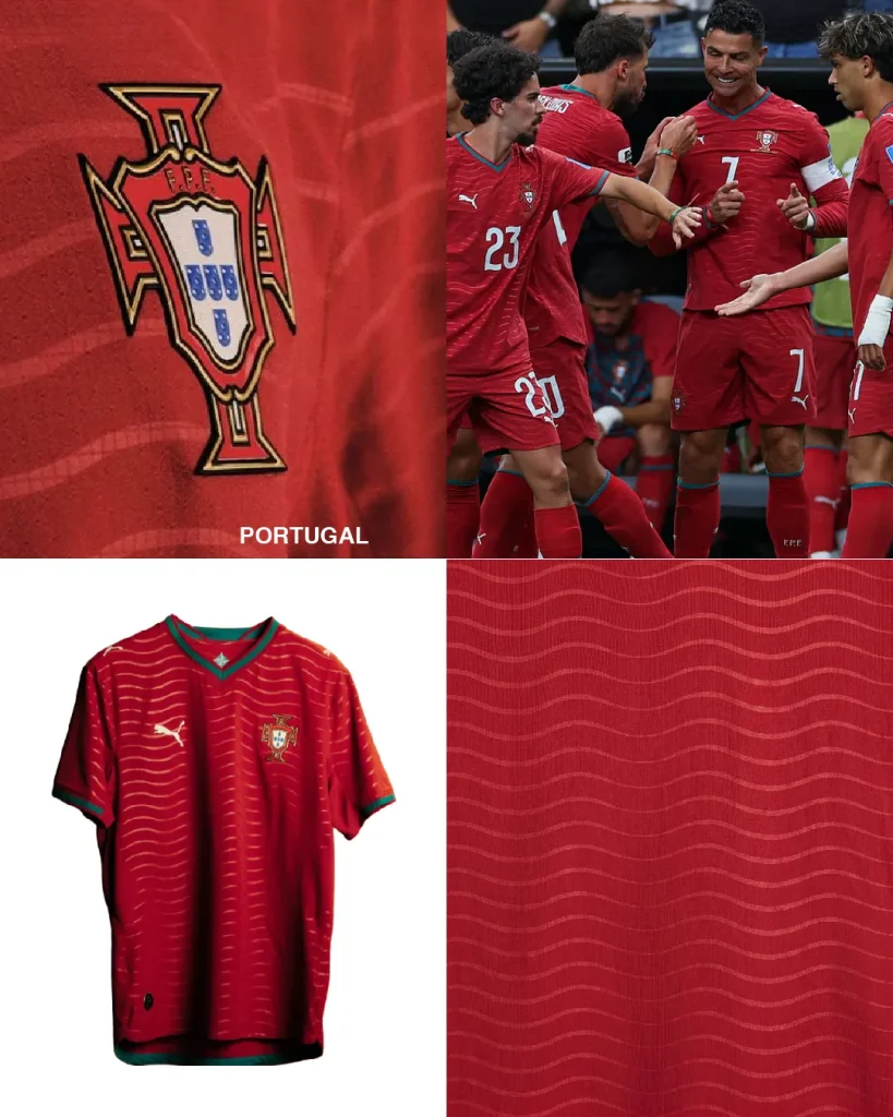
7. Portugal
Of course, we had to include Portugal here. The connection is simply too strong to ignore.
The home kit makes good use of the intensity of red, the presence of the national crest, and an unmistakably Portuguese identity. The away kit, on the other hand, leaves us with more questions than answers, but also with a sense of curiosity. We like the wavy pattern. Perhaps it will bring the trophy back from across the sea.
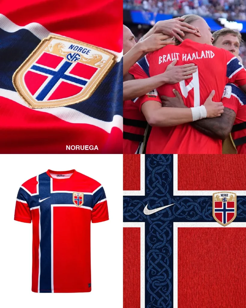
6. Norway
More than a flag, almost a strip of history.
Norway’s kit handles the Nordic cross intelligently, taking it beyond a literal application. There’s something there between Viking heritage, Scandinavian rigor, and contemporary detailing. The extensions of the lines across the sleeves are exactly where they should be.
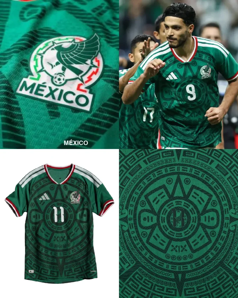
5. Mexico
Mexico rarely misses when it decides to turn identity into a pattern.
Here, the number gives rise to Aztec-inspired symbolism, worked in a tone-on-tone treatment, almost like a graphic amulet on the pitch. It’s a shirt that doesn’t need to shout to make an impact. It has heritage, texture, and personality.
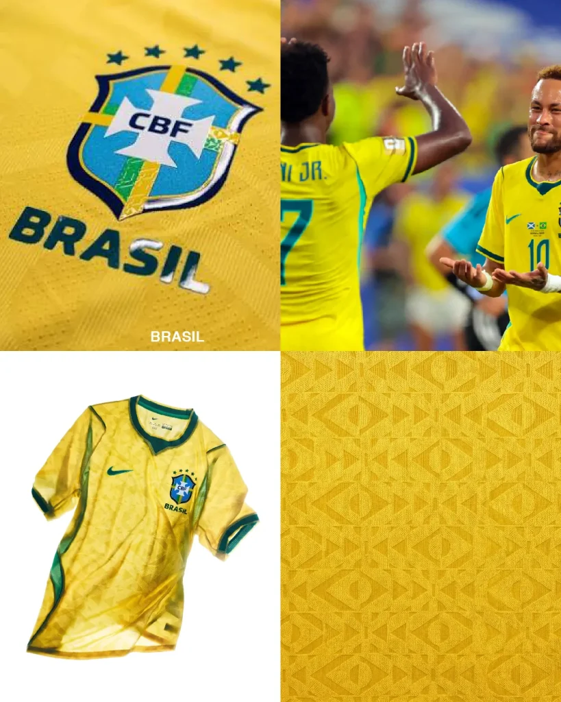
4. Brazil
Some shirts enter a World Cup carrying decades of history on their shoulders. Brazil’s is one of them.
That’s why any intervention on the most recognizable yellow in football is a delicate exercise. This year, the tone-on-tone geometric pattern plays with the flag itself in positive and negative, adding texture without disrupting what is already visual heritage.
It’s Brazil without needing to explain that it’s Brazil.s
And finally, for less scientific but equally valid reasons: it’s on the wishlist of one of the team members.
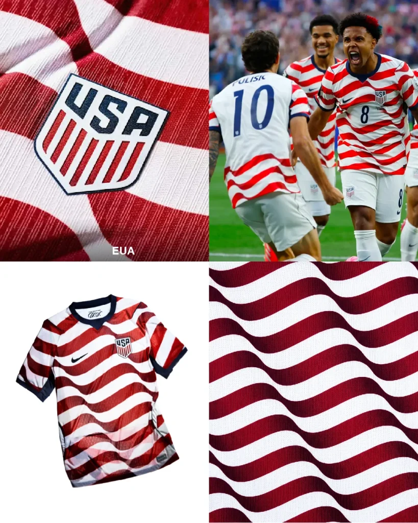
3. United States of America
Like it or not, the team or the country, we’re talking about graphic design here. And graphically, it works.
The United States kit manages to feel distinctly American without falling into the obvious clichés of stars and literal flag imagery. There’s something about it that feels like a jersey, rooted in sports culture, with a touch of quarterback energy, without becoming tacky.
And we all know it hasn’t been an easy time for design. So, it earns its place on the podium.
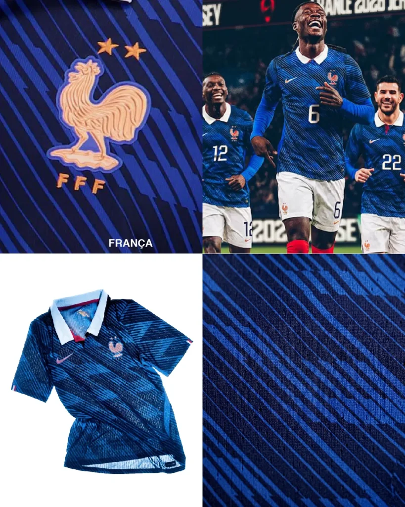
2. France
We’re graphic designers. We want timelessness, grit, history, and stripes. Lots of stripes.
France comes with a strong kit: deep blue, a clear graphic structure, and an oversized rooster that leaves no room for doubt. It’s national, it’s classic, it’s bold.
Sometimes, that’s exactly what a good kit should be.
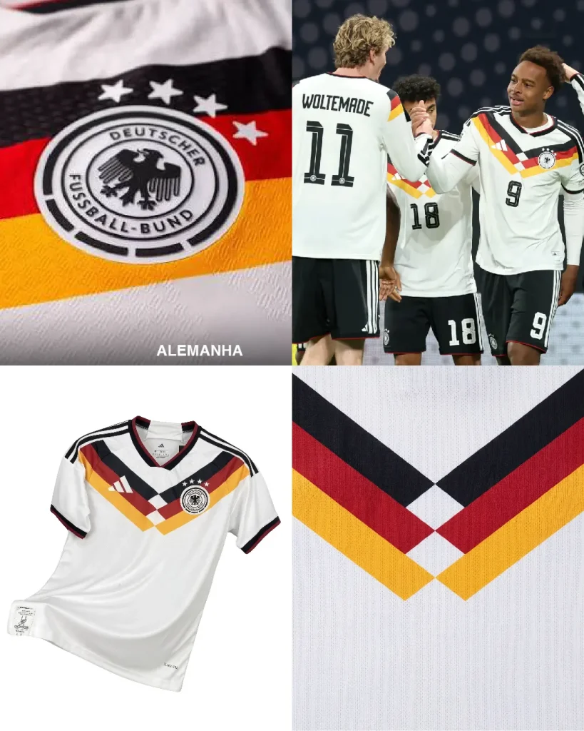
1. Germany
Simple, retro, iconic. For us, the most stylish.
Germany brings back the stripes that filled sticker albums, memories, and World Cup afternoons in the ’80s. The diamonds structure the composition, create symmetry, and give the number room to breathe with authority.